About Our Logo
The logo of Texhong is originated from the idea of heaven and earth and rainbow which is
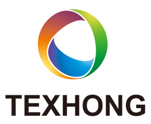
made up by basic images of circles and straps and which indicates the characters and the personality of the textile industry; the English characters is a combination of TEX which means textile and shares the same pronunciation of Tian (heaven).
The vigorous and firm exterior frame of the logo is thereby perfectly linked with the dancing interior structure, which offers a strong feeling of sculpture and lifelikeness and at the same time a feeling of innervation. The three color straps intersect with each other and imply the numerous talents in Texhong as well as a vision of sincere cooperation. For colors, it adopts both warm and cold colors, which not only shows the precision and rationality of industrialized production but also hints the HR Based policy and the devotion to providing quality products and service for both customers and society by Texhong Group.d HONG which is the pronunciation of the surname of the founder, Mr. Hong Tian Zhu.
Blue: Firm and Reliable
Texhong's endless pursuance for technological improvement.
Orange: Passionate and Fashionable
Texhong's focus on service and pursuit of human caring-about.
Green: Natural and Intimate
Texhong's recognition of environmental protection, advocate of nature and idea of serving society.
The logo follows the tradition of simplicity but connote intense meanings. The three colors well match each other and offer a clear and pleasing image. Furthermore, the plump and gentle lines offer a more beautiful feeling.
Our Vision
A leading and influential enterprise in the textile industry.
Our Mission
We commit ourselves to develop high value added products and maximize value for shareholders, customers and staff while rewarding to the society.
Texhong Core Value
-
Integrity and Cooperation: we cooperate in accordance with reliance and responsibility.
-
Innovation and Excellence: we aspire innovation and improvement to benefit our customers.
-
Customer oriented: we insist on fast strain to meet the customers’requirements.
Texhong Action Creed
We continuously strive for learning, insist on action, and struggle to win.
We put company stake on top of individual stake, and team honor on top of personal honor.
We encourage responsibility, initiative, mutuality and growth.
We watch closely the market, find out client’s demand, and respond quickly without delay.
We ensure products quality and value, and deliver to clients on time.
We innovate new ideas and products, and improve them continuously.
We find out problems and figure out the solutions.
We should accomplish every assignment completely without any excuse.
We should save every kind of resources, even a drop of water, a liter of oil, a grain of rice or a kilowatt hour of electricity.
Our Management Principle
Specialization, Internationalization, Professionalism
Excel in quality, concentrate on management, strive in marketing, succeed in product variety